Showing posts with label chart. Show all posts

Sunday, February 13, 2022

Samuel Chamberlain's elaborate failed volvelle

Above Drawing by American artist Samuel Chamberlain. Born in 1895 in Cresco IA, he can’t have stayed there for long. He is buried in Marblehead MA, where he died in 1975. He grew up in Washington State, studied architecture at MIT, and served in both World Wars. He went on the become a widely-admired architectural illustrator and printmaker. His exquisite pencil renderings were often published in art-related periodicals, including the architectural journal Pencil Points. In the passage below, he seems to be describing his proposal (never published) for a wheel-like “information chart” (commonly called a volvelle), not unlike those included in Jessica Helfand’s book, Reinventing the Wheel (NY: Princeton Architectural Press, 2003) [see cover below].

•••

Samuel Chamberlain, Etched in Sunlight: Fifty years in the graphiuc arts. Boston: Boston Public Library, 1968, pp. 94 and 98—

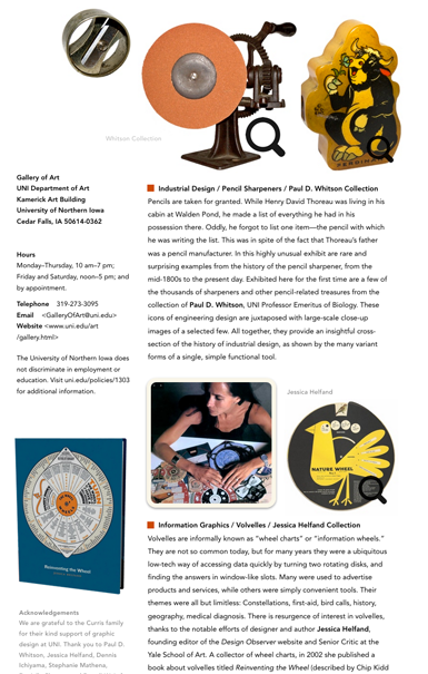
Along with so much printmaking, I spent most of my spare time [c1938] on a totally different project—a wine chart. My interest in the red and white wines of France has always been intense and relentless, and I was determined to combine the graphic arts with gastronomy in one package that would appeal to all gastronomes and oenophiles. A richly decorative chart, brightened with maps, vignettes and pen-and ink sketches, was the result. Everything was hand-lettered. Openings of various sizes were cut in the chart, and these revealed information on various wines, lettered on a disk. Turn the disk to the right place and all the pertinent data on red Bordeaux, red Burgundy, or Cotes-du-Rhone wines would be progressively revealed. There was a descriptive essay on each wine, mention of good culinary companions, proper serving temperature, good recent years, and the significant names of each type of wine. On the other side of the disk was assembled the same information on the great French white wines, those of Burgundy, Bordeaux, Champagne, Vouvray and Anjou, and Alsace. On the two faces of the chart were drawings of typical bottles and wine glasses, and suggestions of what harmonious wine to serve with food, from oysters, soups, fish, shellfish, chicken, red meats, game and cheese, down to desserts and pastry. There were pointers on the technique of serving wine and on secondary vintages, and a list of gastronomic enemies of wine, from anchovies to Tabasco sauce.

I am absolutely appalled at the magnitude of this undertaking, and feel now that my days would have been spent far more usefully…Once the chart was finished, I showed it to several publishers, all of whom turned it down because it presented too many production problems. It has been in my portfolio all these years, a reminder of a magnificent and earnest way to waste one's time.


Monday, February 1, 2021

turned, hopped up, and sharply rapped the door

Paul Pfurstscheller (c1910)

Above
Detail (restored and adapted) of anatomical wall chart by Austrian zoologist Paul Pfurtscheller (1855-1927), c1910.

 •••

Linda Elegant, “The Chicken” in Paul Auster, ed., I Thought My Father Was God, and Other True Tales from NPR’s National Story Project. New York: Henry Holt, 2001—

As I was walking down Stanton Street early one Sunday morning, I saw a chicken a few yards ahead of me. I was walking faster than the chicken, so I gradually caught up. By the time we approached Eighteenth Avenue, I was close behind. The chicken turned south on Eighteenth. At the fourth house along, it turned in at the walk, hopped up the front steps, and rapped sharply on the metal storm door with its beak. After a moment, the door opened and the chicken went in.

Friday, September 7, 2018

Elena Diane Curris Design Exhibition | 2018

Opening on October 8, 2018, at the Gallery of Art at the University of Northern Iowa is the first of an on-going series of biennial design-themed exhibitions. Titled The Reach and Richness of Design: The Elena Diane Curris Biennial Design Exhibition, it consists of five components representing architectural design, editorial illustration, industrial design, information graphics, and wood type and typography. Included are works by Frank Lloyd Wright, Dennis Ichiyama, Ad Reinhardt and others, as well as historical artifacts from the collections of Jessica Helfand, and Paul D. Whitson. The exhibition is one part of The Elena Diane Curris Endowment, which also provides for the return to campus annually of past graduates of the UNI Graphic Design program, which is housed within the Department of Art. more>>>


Tuesday, December 23, 2014

Gaming Infographic | Kramer Dixon

Gaming infographic © Kramer Dixon 2014
Above Gaming infographic by University of Northern Iowa graphic design student Kramer Dixon (2014).

•••

Philip Hone (American diarist and Mayor of New York), talking about US senator and orator Daniel Webster, on March 29, 1845, in The Diary of Philip Hone—

Old men are apt to be careless and slovenly in their dress…Black is safest, it is peculiarly the garb of a gentleman, and never goes out of fashion. But in this matter of dress one of our great men (than whom there is non greater), Mr. Webster, has a strange fancy. He is not slovenly, but on the contrary tawdry, fond of a variety of colors. I do not remember ever to have seen him in the only dress in which he should appear—the respectable and dignified suit of black. I was much amused a day or two since by meeting him in Wall Street, at high noon, in a bright blue satin vest, sprigged with gold flowers, a costume [as] incongruous for Daniel Webster as ostrich feathers for a sister of charity.

Saturday, December 20, 2014

Titanic Infographic | Bradley Kennedy

Infographic © Bradley Kennedy (2014)
Above Infographic by University of Northern Iowa graphic design student Bradley Kennedy (2014).

•••

Henry Adams, in Victor Schreckengost and 20th-Century Design (Cleveland OH: Cleveland Museum of Art / University of Washington Press, 2001), p. 10.—

Another of [drawing instructor Frank N.] Wilcox’s exercises [at the Cleveland Institute of Art in the 1920s] was to go down to the Five and Ten on 105th Street and look at the objects in the window for 45 minutes. Back at the school, the students would make drawings of precisely what they had seen—the objects, the prices, and every other detail. After completing the drawings, they went back to the store window to make sure that everything was accurate.

•••

Robert Craft, An Improbable Life (Vanderbilt University Press, 2002), p. 33—

On Sunday afternoon, December 7, 1941, my father and I were watching a football game in Rockville Center, Long Island, when a loudspeaker announced the bombing of Pearl Harbor. The game went on as though the statement had not been understood, or taken for another Orson Welles radio hoax, but when twice repeated, the stunned, disbelieving crowd in the bleachers began to drift away. As we drove back to Manhattan, the automobile radio sputtered news bulletins, one of which said that the Museum of Fine Arts in Boston had been cordoned off by police because of concern that its great collection of Japanese Art might be endangered by reprisals.