Showing posts with label designers. Show all posts

Sunday, September 3, 2023

the family chair in which one customarily dies

Above Armchair designed by Charles Rennie Mackintosh, Glasgow (1898).

•••

Stark Young, The Pavilion: Of People and Times Remembered, of Stories and Places. NY: Charles Scribner’s Sons, 1951, p. 78—

…in another branch of [his father's] family, nine Douglass men had gone from a single household to [serve in] the [American] Revolution. It was in this Douglass family that they had what was known as the Douglass chair. The custom was for every man in the house, when the moment came for him to die, to rise from his bed and go, or else be carried, to meet his death sitting in this chair. 

Monday, February 20, 2023

novelist jerzy kosinski / visage of a painted bird

The Embellished Bird
James Park Sloan, Jerzy Kosinski. New York: Dutton, 1996, pp. 336-337—

On weekends he [the novelist Jerzy Kosinski] sometimes went with George and Freddie Plimpton and their crowd to Pimpton’s mother’s place in West Hills, where parlor games were the order of the day. They playing hiding games like “murder” and “sardines”…To Plimpton’s surprise, after all his talk about hiding, in his apartment and during the war, Kosinski was not particularly good at the hiding games…
On the other hand, he demonstrated his ability to fold himself neatly into a bureau drawer, and when the situation was under his control, he played his usual pranks. 

••• 

Gabrielle Selz, UnStill Life. W.W. Norton, 2014, p. 145—

In between her crying jags [in response to her husband’s departure], she [the author’s mother] dated. Once a man with thick black hair and the large beaked nose of a bird came to the front door to pick her up. He was introduced as Jerzy Kosinski, the author of a controversial book my mother had on her shelf, The Painted Bird, about a boy surviving the Holocaust. They didn’t go out for long. Kosinski was an eccentric who liked to disappear. Mom once discovered him curled up and hiding in a large bureau drawer. He was too strange for her tastes.

Monday, June 13, 2022

Coming Soon / Graphic Design Symposium

Reproduced above is a sampling of on-site photographs (courtesy Taekyeom Lee) from an on-going exhibition at the University of Wisconsin-Madison, titled EVOLVING GRAPHIC DESIGN. The exhibition (which includes the work of twenty-three graphic design professionals and design educators from across the nation) continues for the next twelve days, ending on June 24. 

The concluding highlight of the exhibition will be a two-day symposium, to be held on June 23 and 24, in the Art Loft Conference Room, Art Lofts Building, in the Department of Art, University of Wisconsin-Madison at 111 North Frances Street, in Madison. Some participants are attending in-person, while others (worldwide) are registering online for free tickets, and, since it is a hybrid event, they will participate online as speakers, panelists and observers. 

Please note, although participation is free, you must register at this link in advance. 

Iowa Insect Series (stages animated)

Included in the exhibition is a series of ten large-scale digital montages, called the Iowa Insect Series, that were made in 2012-2013 in collaboration with design colleague and friend David M. Versluis. At the time, he was a Professor of Art and Design at Dordt College in Iowa, while I was then on the faculty at the University of Northern Iowa in Cedar Falls. 


Also on exhibit are thirteen design-related images that are part of my long-term, continuing research (as a design historian) of World War I Allied naval camouflage. The theme uniting these artifacts is high difference or disruptive ship camouflage, which was referred to at the time as dazzle painting or dazzle camouflage. Among the items exhibited are restored government photographs from the time period, full-color reproductions of diagrams of the camouflage patterns, and my own recent hypothetical camouflage schemes, derived from historical works of art.

Iowa Insect Series

Tuesday, November 24, 2020

be ruthless with opponents of modern painting

Cover of Hampton's Magazine (1910)

Stephen Potter
, "Notes on Exhibitionship"
in The Complete Upmanship (New York: New American Library, 1978), p. 202—

Be fairly ruthless, I think, with opponents of "modern" painting. If you are lucky enough to find a man who still says: "I don't know about pictures, but I know what I like," point out to him that because he does not know about pictures he does not know what he likes, and repeat this in a thundering voice. If he whimpers back something about it all being too advanced for him, point out exactly how many years Cézanne died before he was born, and the precise date of the exhibition of the first Modiglianis in London. Exaggerate both these dates and say, "After all, Matisse and your great-grandmother are exact contemporaries." If your man says of some picture, "Yes, but what does it mean?" ask him, and keep on asking him, what his carpet means, or the circular patterns on his rubber shoe-soles. Make him lift up his foot to look at them.

RELATED LINKS
How Form Functions
Other sources

Tuesday, July 14, 2020

Sunday, May 3, 2020

Entangled threesome | a walking Läocoon

Coles Phillips "fadeaway" magazine cover illustration (1916)
Above Magazine cover illustration for the October 1916 issue of Good Housekeeping by Coles Phillips (1880-1927). As shown in this example, he was especially known for paintings in which edges of the figure merge with the background. Tragically, he died of tuberculosis at the early age of 47. We reproduced another work of his in an earlier blog post.

•••

Ford Maddox Ford as quoted by Simon Nowell-Smith, compiler, The Legend of the Master (London, Constable, 1947), p. 44—

I was once walking with him [Henry James] and Mr. John Galsworthy…[whose] dachshund Maximilian ran sheep, so, not to curtail the animal’s exercise, the Master had provided it with a leash at least ten yards long. Mr. Galsworthy and I walked one on each side of James listening obediently while he talked. In order to round off an immense sentence the great man halted…He planted his [walking] stick firmly into the ground and went on and on and on. Maximilian passed between our six legs again and again, threading his leash behind him. Mr. Galsworthy and I stood silent. In any case we must have resembled the Laocöon, but when Maximilian had finished the resemblance must have been overwhelming. The Master finished his reflections, attempted to hurry on, found that impossible. Then we liberated ourselves with difficulty. He turned on me, his eyes fairly blazing, lifting his cane on high and slamming it into the ground: “H…” he exclaimed, “you are painfully young, but at no more than the age to which you have attained, the playing of such tricks is an imbecility! An im…be…cility!”

Thursday, March 26, 2020

The ingenious posters of designer Abram Games

Abram Games, WWII-era poster
Without hesitation, one of the finest designers in modern history was British graphic designer Abram Games (1914-1996). Shown here are two rather similar but equally excellent posters he made during World War II, both of them appealing to the wartime public to be self-sufficient. As is characteristic of many of his posters, they are astonishing visual puns. In an essay in his book, Topics of Our Times (London: Phaidon, 1991), British art historian E.H. Gombrich acknowledged that Games was indebted to the "deliberate ambiguities and illogicalities" of the work of such Surrealists as Max Ernst and Salvador Dali. But many of those works, he went on to say—

were pointless… [and] were aimed at defying the canons of reason to shake our complacency. In the art of Abram Games the very puzzlement caused by such arresting images is given an added purpose. We attend because we are momentarily baffled, and thus we are ready to seek for the message, which we will remember all the better for having discovered it in such a flash of recognition.

Abram Games, WWII-era poster

Tuesday, September 10, 2019

Graphic Design Alum | Matthew Menz at UNI

Poster © Phil Fass (2019)
Coming Thursday evening of this week: Matthew Menz, graduate of the Graphic Design Program at the University of Northern Iowa, and now Amazon Web Services Director in San Francisco, will speak in the Art Auditorium, Kamerick Room 111, at 7:00 pm, September 12, 2019. Free and open to the public. Made possible by funding from The Elena Diane Curris Endowment for Design.

Thursday, July 25, 2019

Frank Lloyd Wright and Ezra Pound

Frank Lloyd Wright Posters © Roy R. Behrens 2017-18
I ran across this recently in Humphrey Carpenter's gargantuan biography, A Serious Character: The Life of Ezra Pound New York: Dell, 1990, p. 832. It has to do with the controversy in the fall of 1957 about what do with American poet Ezra Pound. At the end of World War II, he had been arrested in Italy by the US Army, and charged with making treasonous (and anti-Semitic) wartime radio broadcasts against President Franklin D. Roosevelt and in praise of Mussolini. Brought back to the US, it was decided that he was mentally unfit to stand trial, and was instead committed to St. Elizabeth's psychiatric hospital in Washington DC.  A dozen years later, when his release became a possibility, there was much debate about where he should be permitted to live (he moved back to Italy). Lots of people offered suggestions about what should happen to Pound—even architect Frank Lloyd Wright—

[Editor and publisher James Laughlin] reported that Frank Lloyd Wright, the architect, was willing for Ezra to come and live with him at Taliesin West, the house had designed for himself near Phoenix AZ.  This prospect greatly tickled [poet Robert] Frost, especially as he had feared the spectacle of Ezra leaning across his own fence. "I can hardly resist the temptation of putting Ezra and Frank Lloyd Wright in the same gun turret," he wrote, "but we must be serious where so much is at stake for poor Ezra. I should think he might acceapt a house from the great architect for the great poet at a safe distance."

Below A spread from our book on Frank Lloyd Wright and Mason City: Architectural Heart of the Prairie. It is not a book about his marital indiscretions, his arrogance or his leaky roofs. Nonetheless, it has often ranked among the top selling books about Wright on Amazon since its publication in 2017.

Frank Lloyd Wright and Mason City

Friday, September 7, 2018

Elena Diane Curris Design Exhibition | 2018

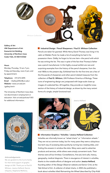
Opening on October 8, 2018, at the Gallery of Art at the University of Northern Iowa is the first of an on-going series of biennial design-themed exhibitions. Titled The Reach and Richness of Design: The Elena Diane Curris Biennial Design Exhibition, it consists of five components representing architectural design, editorial illustration, industrial design, information graphics, and wood type and typography. Included are works by Frank Lloyd Wright, Dennis Ichiyama, Ad Reinhardt and others, as well as historical artifacts from the collections of Jessica Helfand, and Paul D. Whitson. The exhibition is one part of The Elena Diane Curris Endowment, which also provides for the return to campus annually of past graduates of the UNI Graphic Design program, which is housed within the Department of Art. more>>>


Saturday, September 2, 2017

Nonsensical Info Graphics | Chad Hagen

Nonsensical Infographic © Chad Hagen
Above This exquisite image by Minneapolis-based designer Chad Hagen is what he calls a nonsensical infographic. As he explains, infographics are usually judged on "how well they communicate their data." But in Hagen's delightful series of prints (he should do more!), the table is turned. He has omitted the data, reversing the priorities of form and (the customary) function of infographics.•

•••

Edna Ferber, A Peculiar Treasure. New York: Doubleday, Doran and Company, 1939, pp. 114-115—

[While she was working as a newspaper reporter in Appleton WI, Ferber was assigned to interview the famous magician and escape artist Harry Houdini, who had grown up in the same town.] Celebrities didn't come our way often. When Houdini, the Handcuff King, arrived with his show he got shorter shrift than he deserved, being a hometown boy. Before my day, he had been a local product, [named] Harry Weiss, the son of a Russian Jewish rabbi. Failing to find him at his hotel I encountered him by chance on College Avenue at the drugstore corner just across from the [Appleton Daily] Crescent office. Outside the store was the usual slot machine containing chocolate and chewing gum. As he chatted affably with me Houdini leaned carelessly against this. At the end of the interview he dropped a cold metal object into my hand.

"There's the padlock to this slot machine," he said. "Better give it to the drugstore man. Somebody'll steal all his chewing gum."

I hadn't seen so much as a movement of his fingers. Tottering with admiration I went back to the office to write my story.

• For more on form and function see this new top-selling book about Frank Lloyd Wright.

Thursday, June 30, 2016

League of Women Voters Poster 2016

Women's Equality Poster © Roy R. Behrens
Above It's always gratifying to use ones skills and expertise in promoting worthy causes, the equal rights of women in this case. The story of the struggle for equal rights (for women and others) is a fascinating history, and one that is always on-going. This is a poster we designed pro bono to announce Women's Equality Day (August 20, 2016), on behalf of the League of Women Voters of Black Hawk and Bremer Counties in Iowa.

Tuesday, June 21, 2016

Rod Library Art Exhibition | Roy R. Behrens

Above Through the kindness and efficiency of Angela Pratesi and Julie Ann Beddow at the Rod Library, University of Northern Iowa, seven of my recent works are on exhibit this summer in the library's Learning Commons. These digital montages, which date from 2011-2015, are part of the library's permanent art collection. See installation views above, with single views of each below.

Auto Parts © 2013
Dorado © 2015
Barbarian Seville © 2011
Deplorable Strikes © 2011
Indigenous Nativity © 2011
A Loss for Words © 2011
Nautilus Bridge © 2011

Sunday, October 25, 2015

Brushed by the Grasses of Self-Reproach

Montage | Roy R. Behrens 2015 | Puffin Wikipedia
Mae West—

You're a fine woman, Lou. One of the finest women that ever walked the streets.

•••

Pierre-Jules Renard—

It should not be thought that laziness is unproductive. Within it, you live intensely, like a hare listening. You swim in it like water; and are brushed by the grasses of self-reproach.

•••

Charles Dickens (The Pickwick Papers)—

Miss Bolo rose from the table considerably agitated, and went straight home, in a flood of tears and a sedan chair.

Saturday, October 3, 2015

Explorations of Type | Chase Murphy

all images © Chase Murphy 2015
On a recent somber autumn day, my spirits were lifted by running across the work from last semester of Chase Murphy, who earned a BA in Graphic Design at the University of Northern Iowa in May of 2015.


In that semester, he was enrolled in a class I taught on the History of Design. When asked to take on related research, he created a stunningly beautiful book about historical typefaces. Each typeface was assigned a spread in which its finest attributes were described in a brief narrative and then visually conveyed by a fresh and engaging arrangement of type. Shown here are examples of only one side of a few of the spreads, but the spreads in full are online here.


Sunday, August 16, 2015

Typographic Poster | Stephanie Berry

Typeface Poster © Stephanie Berry 2015
Above Poster by Stephanie Berry, graphic design student, Department of Art, University of Northern Iowa, in celebration of the typeface Futura (2015)

•••

Kate Learson, quoted in Remar Sutton and Mary Abbott Waite, eds., The Common Ground Book: A Circle of Friends. Latham NY: British American Publishing, 1992, p. 181—

So many people who say they are artists are just technicians who are trying to capture the PR wave of something avant-garde; the work may be different, but the intention sometimes looks so shallow. So many people now, not only in painting and sculpture but in music and probably literature, seem to be producing cheap knockoffs and are into just promoting themselves.

Thursday, April 9, 2015

Typographic Poster | Alexandria Toszegi

Typographic poster © Alexandria Toszegi 2015
Above Poster by Alexandria Toszegi, graphic design student, Department of Art, University of Northern Iowa (2015), in celebration of type designer Paul Renner and his design of the typeface Futura.

•••

Fran Lebowitz—

If thine enemy offend thee, give his child a drum.

•••

Judith and Neil Morgan, Dr. Seuss and Mr. Geisel. New York: Random House, 1995, p. 73—

One unborn scheme [devised by Dr. Seuss and his friend Hugh Troy] was to launch a private detective agency named Surely, Goodness and Mercy. Its slogan was to be biblical: "[Surely, Goodness and Mercy] Will follow you all the days of your life."

Sunday, April 5, 2015

Typographic Poster | Alex Waters

Typographic poster © Alex Waters (2015)
Above Poster by Alex Waters, graphic design student, Department of Art, University of Northern Iowa (2015), in celebration of printer Claude Garamond and the typeface that now bears his name, Garamond.

•••

Larry Rivers, What Did I Do?: The Unauthorized Autobiography (New York: HarperCollins, 1992), p. 163.

The studio behind these windows [below the engraved building sign at 122 Second Avenue in New York] was the largest and lightest of the three on the fifth floor. Harry Holtzman, an artist, held the lease. He brought Piet Mondrian to the United States and offered him the use of that space. Piet walked up the five flights to look Harry's place over, decided he was not up to the climb. Harry found him a studio a little more down to earth, uptown. If 122 had had an elevator, Mondrian's Broadway Boogie-Woogie would have been called Second Avenue Boogie-Woogie.