Showing posts with label book design. Show all posts

Tuesday, August 15, 2023

Walter Hamady // book artist and paper maker

Above (and below) Title frame and other single frames from a new 20-minute video talk about Walter Hamady (1940-2019), prominent book artist, paper-maker, and collagist, who was well-known as a teacher at the University of Wisconsin at Madison. 

Having earlier taught in Milwaukee for ten years, I had become aware of his work in the 1970s. Because of his liking for Ballast Quarterly Review (which I had founded in 1985), he and I began to exchange spirited letters (along with a mix of enclosures), once or twice or more a month. 

This led to collaborations of one kind or another, eventually resulting in exhibitions, published essays, and an archive of his artist’s books. I saved everything, even all the envelopes and mailing containers, in part because they were always addressed to mutilations of my name, such as Corps du Roy, Rhoidamoto, Trompe L’Roi at Labbast, Royatolla, and so on. This continued for more than a decade, perhaps to the mailman’s amusement.

Looking back on what I have, I have now produced a video talk (a brief memoir-like tribute) titled BOOK ART: Walter Hamady’s Books, Collages and Assemblages, which can be accessed free online on my YouTube channel.


Friday, March 10, 2023

familiar american icons / artifacts made strange

Above Dust jacket for Brooke L. Blower and Mark Philip Bradley, eds., The Familiar Made Strange: American Icons and Artifacts After the Transnational Turn. Ithaca NY: Cornell University Press, 2015.  Available online at Internet Archive.

•••

In browsing, I was struck by the power and appropriateness of this book cover (annoyingly, the cover designer goes unmentioned). The contents of the book are equally interesting, such as “William Howard Taft’s Drawers” by Andrew J. Rotter, and “Josephine Baker’s Banana Skirt” by Matthew Pratt Guterl. As noted in an earlier blog post, it was a Nebraska expatriate playwright named Virgil Geddes whose job it was to assist Josephine Baker in donning her famous scanty banana attire at the Folies Bergere.

The often-quoted phrase “to make the familiar strange” can be traced to an essay titled “Art as Technique" by Russian formalist critic Victor Shklovsky, first published in 1917. His term for the process was defamilarization or ostranenie. I myself prefer this translation of what he wrote—

Habitualization devours works, clothes, furniture, ones wife, and the fear of war…And art exists that one may recover the sensation of life; it exists to make one feel things, to make the stone stony. The purpose of art is to impart the sensation of things as they are perceived and not as they are known. The technique of art is to make objects “unfamiliar,” to make forms difficult, to increase the difficulty and length of perception because the process of perception is an esthetic end in itself and must be prolonged. Art is a way of experiencing the artfulness of an object, the object is not important.

In The Novel of the Future (1968), the writer Anaïs Nin rephrased Shklovsky’s concept in a brief (and perhaps too familiar) form as follows—

It is the function of art to renew our perception. What we are familiar with we cease to see. The writer shakes up the familiar scene, and as if by magic, we see a new meaning in it.

As I have written elsewhere, I became acquainted with Victor Shklosky’s ideas during years of corresponding with American writer Guy Davenport. It eventually occurred to me that there is a reciprocal process, of equal value in the innovation process, which might be called “making the strange familiar.”

Sunday, January 1, 2023

when reading his poems he performed them

book cover
In 1976, I was fortunate to be asked to design a paperbound edition of Joseph Langland’s The Sacrifice Poems for the North American Review, at the University of Northern Iowa. I was a young designer / teacher, and I am no longer happy with how I handled the page layout. But I remain very pleased with the cover, which is shown above.

Soon after I designed that book, I moved to a teaching position at another university, and moved elsewhere after that. But I rejoined the UNI faculty in 1990, where I taught graphic design and illustration, including book design. More than a decade later, Joseph Langland retired from teaching and he too moved back to Iowa. In 2004, near the end of his life, Langland talked to a class of my students at the UNI about the role of rhythmic sound and the music of the voice in the recitation of verse.

I think it would be fair to say that my students were astonished by Joe Langland’s presentation that day. One could say they were taken aback, because whenever Langland read his poems, it was more that he “performed” them—and in fact he often ”sang” the lines. The session was filmed, and having recently been edited, it can be accessed free online, and freely shared with others..

He also talked about his past, not knowing that his life would end a few years later. He recalled how he was drawn to literature at a very young age, and thereafter used poetry as a way to try to understand his life, such as growing up on a family farm, his rich Norwegian heritage, the death of his younger brother, and his lingering memories of having been an officer in the US Army infantry in Europe during World War II.

His talk took place on Veterans Day, on November 11, 2004. He died in 2007.

Tuesday, November 8, 2022

Armitage as impressario and aristocrat of art

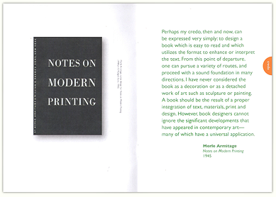
Above I have written about the American graphic designer Merle Armitage because he was, undoubtedly, an accomplished book designer, whose primary income came from his activities as a "booking agent" or "impressario" for prominent performing artists, among them Anna Pavlova, Amelita Galli-Curci, Rosa Ponselle, and the Diaghilev Ballet. He wrote books about these and other artists because, as he once explained to Henry Miller, it provided him with the opportunity to design books, which is what he most enjoyed. My long essay on his life is online here. At the same time, I have also known that some of his personal qualities were less than admirable. I was reminded of that as I recently read this passage in Ione Robinson's autobiography (below).

•••

Ione Robinson, A Wall to Paint On. New York: E.P. Dutton, 1946, page 79—

The heat is stifling, and I have spent most of the day sitting [in Los Angeles] in the Plaza waiting to meet the Mexican Consul. I tried to forget the heat by reading something Merle Armitage gave me as I was leaving: a copy of his address before the California Art Club's Open Forum. It didn't help me bear the heat; in fact, it really frightened me, because Mr. Armitage seems to want to be the Lorenzo de Medici of Los Angeles. Already everyone listens to him, and the younger artists at home are under his thumb, simply because he can afford to buy a canvas when he wants to (although he never spends over a certain amount on any canvas, which is so small that in the end it does not really help a poor painter). But in this speech he is trying to prove that there is an “aristocracy in art”: he carefully quotes Webster on the definition of Aristocrat and Common, and then tries to twist a special meaning out of these words that will justify his right to judge esthetics. I really believe that he would like to feel that he is the arbiter of greatness in the art of our time. He believes that the masses of people have nothing to contribute to art, nor is their judgment to be relied upon, and argues that without people like himself there would never have been artists and writers like El Greco and Voltaire. What he forgets is that El Greco and Voltaire painted and wrote for the people, and not just for men like Merle Armitage. He actually wrote this: “How can the really common people have anything in common with, anything of sympathy for, as aloof and aristocratic a thing as art? If left to the common people, and I use the word ‘common’ as I have previously defined it, there would be no art.” The reason this frightens me is because Mr. Armitage is already the manager of the Los Angeles Grand Opera Association, and now seems on the verge of being the impresario of painters in California. I am glad I'm going to Mexico.

Ione Robinson (source)


Monday, February 28, 2022

hurly burly Morris with few detachable phrases

Review of Linda Parry, William Morris
Above Opening page of our published review of Linda Parry's biography of Arts and Crafts legend William Morris, as published in PRINT magazine (January / February 1997). Morris is featured briefly in the autobiography of one of his admirers, the Irish poet William Butler Yeats. In the passage quoted below, Yeats refers to Morris as having a "burly body." In reference to that, British satirist / caricaturist Max Beerhohm once wrote that Morris was "a wonderful all-round man, but the act of walking round him always tired me."

•••

William Butler Yeats, The Autobiography of William Butler Yeats: Consisting of reveries over childhood and youth, the trembling of the veil, and dramatic personae. New York: Macmillan, 1953, p. 89—

He had few detachable phrases, and I can remember little of his speech, which many thought the best of all good talk, except that it matched his burly body and seemed within definite boundaries inexhaustible in fact and expression. He alone of all the men I have known seemed guided by some beast-like instinct and never ate strange meat. “Balzac! Balzac!” he said to me once, “Oh, that was the man the French Bourgeoisie read so much a few years ago.” I can remember him at supper praising wine: “Why do people say it is prosaic to be inspired by wine? Has it not been made by the sunlight and the sap?” and his dispraising houses decorated by himself: “Do you suppose I like that kind of house? I would like a house like a big barn, where one ate in one corner, cooked in another corner, slept in the third corner, and in the fourth received one's friends”; and his complaining of Ruskin's objection to the underground railway [the Tube, the London subway]: “If you must have a railway the best thing you can do with it is to put it in a tube with a cork at each end." I remember, too, that when I asked what led up to his movement, he replied: "Oh, [John] Ruskin and [Thomas] Carlyle, but somebody should have been beside Carlyle and punched his head every five minutes.”

Saturday, July 31, 2021

Roycroft / Elbert Hubbard and Alice Hubbard

online version
Having taught courses in the history of design for many years, I have of course long known about the Roycroft Workshops in East Aurora NY, as well as their proprietors, Elbert Hubbard, and his second wife, Alice Moore Hubbard. But until recently, I hadn't realized the extent of their connections to people and events in Iowa. This new essay from The Iowa Source discloses the various details.

Sunday, March 7, 2021

aesthetics / each species appears itself designed

Ogden
Above Roy R. Behrens, Ogden (© 2021). Digital montage.

•••

James Hillman, Cosmos, Life, Religion: Beyond Humanism, 1988—

Animal life is biologically aesthetic: each species presents itself in design, coats, tails, feathers, furs, curls, tusks, horns, hues, sheens, shells, scales, wings, songs, dances.

•••

Tom Driberg, Baron Bradwell, quoted in the Daily Express (1937)—

Sincerity is all that counts…Think again. Bolsheviks are sincere. Fascists are sincere. Lunatics are sincere. People who believe the earth is flat are sincere. They can’t all be right.

Friday, October 2, 2020

Braiding Sweetgrass by Robin Wall Kimmerer

Below Our friend Tony Drehfal says this book, Braiding Sweetgrass by Robin Wall Kimmerer (Milkweed Editions, 2020)—a special edition is coming out soon—is one of his favorite books, and not just because one of his exquisite wood engravings is featured on the dust jacket.


Sunday, January 12, 2020

As much chance of surviving as a sewer rat

American book designer Merle Armitage
In the early 1940s, shortly after the novelist Henry Miller had moved back to the US from Paris, he concluded that a noncommercial artist in America "has as much chance for survival as a sewer rat.”

Refusing to borrow or to hire out for "stultifying work," he sent out a letter inviting support from the readers of The New Republic, requesting, among other things. "old clothes, shirts. socks. etc. I am 5 feet 8 inches tall, weigh 150 pounds, 15 1/2 neck, 38 chest, 32 waist, hat and shoes both size 7 to 7 1/2. Love corduroys.”

The appeal worked and a number of curious mailings arrived, one of which contained a complete tuxedo. "What'll I ever do with this?” Miller asked a friend, then used it to dress up a scarecrow that sat for a generation on the picket fence in front of his Partington Ridge house in Big Sur, California.

Among other gifts was a cash contribution from Merle Armitage, an Iowa-born book designer, civil engineer, set designer, concert promoter, gourmet cook, art collector, and author. Armitage was living in California then, and soon after, when he visited Miller’s home for the first time, he described his own profession as that of an “impresario." "But I have heard that you were a writer,” replied Miller. "If the truth were known," Armitage explained, "I write books so that I will be able to design them.” In fact, by that time Armitage had designed nearly two dozen books, some of which he had also written.

But Miller was incredulous: “Does a book have to be designed?” he asked. “A book is a book, and I don’t see how you can do anything about it.” more>>>

Sunday, April 14, 2019

2019 Graphic Design Portfolio Night at UNI

Portfolio Night Poster by Madelyn Stillman, 2019
Above Each spring semester, the graphic design students and faculty in the Department of Art at the University of Northern Iowa celebrate the achievements of the graduating seniors. The event is the annual Graphic Design Portfolio Night, as announced by this exquisite poster, designed by one of those graduates, Madelyn Stillman.

On Friday, April 26, from 5:30 until 7:00 pm (drop by anytime, leave whenever you'd like), fifteen current BA Graphic Design Majors will be at tables in the hallway of the ground floor of the south wing of the Kamerick Art Building. Their print and online portfolios will be on display, with the students there to talk to visitors (parents, fellow students, faculty, professional designers, prospective design students, alumni, faculty emeritus, you name it—it's open to everyone, and on-campus parking is easy on Friday evenings) about the work that they've achieved.

The person on the graphic design faculty who tirelessly oversees this always impressive annual event is Professor Phil Fass. The works in these portfolios were produced by the students of Fass and his very capable colleague, Professor Soo Hostetler.

The student exhibitors this year are: Philip Adams, Jessica Allen, Kaitlyn Bown, Riley Green, Ellen Holt, Craig Johnson, Kumari Kincade, Josie Love, Mercedes Mancilla, Libby Schwers, Cameron Sievers, Kristin Stein, Madelyn Stillman and Carly Weber.

Friday, March 3, 2017

Mason City, Wright and Book Design

Poster © Roy R. Behrens 2017
Above Frank Lloyd Wright’s achievements in book design will be the subject of an evening talk during National Library Week at the Mason City Public Library, in Mason City IA. Titled Frank Lloyd Wright: Mason City and Book Design, the one-hour presentation will start at 6:00 pm on Tuesday, April 11, 2017. The speaker is author and design historian Roy R. Behrens, who teaches graphic design at the University of Northern Iowa.

Frank Lloyd Wright was an architect, art collector and teacher. His Mason City landmarks are widely known, consisting of the Stockman House, and the City National Bank and Historic Park Inn Hotel. But he also designed furniture, fabrics, dinnerware and stained glass windows. It is not usually noted that he was also a book designer.

In a richly illustrated talk, Behrens will focus on Wright’s efforts at book design, beginning in 1898 with The House Beautiful, a hand-bound letterpress book about interior home design. In that and subsequent efforts, Wright was influenced by various trends in architecture and design, among them the Arts and Crafts Movement, Japonisme, Art Nouveau and Art Deco.

Among Wright’s friends were two prominent book designers, Elbert Hubbard and Merle Armitage. The latter grew up in Mason City, and went on to become the manager and promoter for ballerina Anna Pavlova, operatic soprano Amelita Galli-Curci, humorist Will Rogers, and other star performers. He wrote and designed books about some of the finest artists of the twentieth century, including Martha Graham, Igor Stravinsky, George Gershwin and Edward Weston.

Also featured will be the work of New York publisher Steven Clay, a Mason City native who graduated from Mason City High School in 1969. After moving to New York in the 1980s, Clay established Granary Books, which became a leading distributor of limited edition, experimental “artist books.” In 2013, the archive of Granary Books was acquired by the Rare Book and Manuscript Library at Columbia University, calling it “one of the country’s most significant artist book publishers.”

In addition to slide examples of the books of Wright, Armitage and others, the talk will include a selection of the actual books from the speaker’s book collection. The event is free and open to the public.

•••

Roy R. Behrens, UNI Professor of Art and Distinguished Scholar, teaches graphic design and design history. He is internationally-known for his publications about art, design and the history of camouflage. The author of eight books and hundreds of published articles, he has appeared in films and interviews on NOVA, National Public Radio, 99% Invisible, Australian Public Television, BBC and IPTV. His most recent book is Frank Lloyd Wright and Mason City: Architectural Heart of the Prairie (2016).

Sunday, May 22, 2016

CD-ROM Package Design | Madi Luke

CD-ROM Package © Madi Luke 2016
Above Design for a CD-ROM portfolio by graphic design student Madison (Madi) Luke (©2016), at the University of Northern Iowa.

•••

As I read this recently, I was reminded of The Painted Bird by Jerzy Kosinski. The following is from Richard Neutra, Life and Shape. New York: Appleton-Century-Crofts, 1962, p. 362—

Frank Lloyd Wright told me, I think significantly, not once but on two occasions, the story of a monkey in Malaya. It was caught by a planter, roped around the waist, and tied to a post on his screened porch. During the night the monkey bit off the rope near the post, bit through the screen mesh, and escaped into the jungle to his fellows. But they were no longer fellows to a monkey with a peculiarity—with a rope around his belly. They regarded him with hostility for being different, "and tore him limb from limb." I still remember Mr. Wright's baritone laughter which ended in a bitter smile. Frank Lloyd Wright did not simply have a strange rope around his belly—why did he link this story to himself? What really characterizes the relationship to others of the outstanding man, merely taken as the extra case of a vital individual? Is it tragedy—not only necessity—that the individual, even the best, the most alive, is really not effective , not vital, in a vacuum? Always very soon, sooner or later, he must be involved with others.

See also: Roy R. Behrens, FRANK LLOYD WRIGHT and Mason City: Architectural Heart of the Prairie (2016).  

Wednesday, July 30, 2014

Book Jacket Design | Austin Montelius

Book jacket © Austin Montelius
Above Proposed dust jacket for Joseph Conrad's Heart of Darkness, designed by Austin Montelius (2014), undergraduate at  the Department of Art at the University of Northern Iowa, in a graphic design studio course (as taught by Roy R. Behrens).

•••

Bertrand Russell, quoted in Norman Sherry, Conrad and His World (London: Thames and Hudson, 1973)—

[Joseph Conrad] thought of civilized and morally tolerable human life as a dangerous walk on a thin crust of barely cooled lava which at any moment might break and let the unwary sink into fiery depths.

•••

Anon, in Academy (February 20, 1904)—

In appearance Mr. Conrad suggests the seaman. His figure is stalwart and short, his dark beard well trimmed, and his walk nautical. Meet him near the docks and one would write him down "ship's captain" without hesitation. But his eyes, curiously distinctive and striking, mark him out from his kind. Ship captain he may be, but his eyes proclaim an artist.

Thursday, September 26, 2013

Luther College Writers Festival 2013

Intersections Between Word and Image
University of Northern Iowa graphic design professor Roy R. Behrens will be among the presenters at the 2013 Luther College Writers Festival in Decorah IA on Saturday, September 28. He will appear on a panel on New Writing, New Media (3:00-5:00 pm), and will talk about "Intersections Between Word and Image." Beginning in the 1970s, as a designer/illustrator, he collaborated with various American writers, including Jerzy Kosinski, Guy Davenport, Marvin Bell and others.

Saturday, August 3, 2013

Aubrey Beardsley Portrait | Morgan Moe

Aubrey Beardsley, digital montage by Morgan Moe © 2013
Above Interpretive portrait of artist-writer Aubrey Beardsley (1872-1898), a digital montage by Morgan Moe, graphic design student, University of Northern Iowa. Copyright © 2013 by Morgan Moe.

••

Mary Costigan, quoted in Remar Sutton and Mary Abbott Waite, eds., The Common Ground Book: A Circle of Friends. Latham NY: British American Publishing, 1992, p. 273—

When I taught kindergarten in a church basement, the men's room was a couple of doors down from the kindergarten proper. I missed a little boy but knew that he was probably in the rest room. I waited a little while and he never came back. So I went down and spoke to him through the door, asked him if he was having problems or anything. I didn't get an answer. I kept talking to him, telling him to hurry up. No answer. Finally, I told him I was going to come and get him. To which the pastor's voice replied, "I'm in here."

Wednesday, July 24, 2013

Jorunn Musil | Juicebox Interactive

Book cover design (2008) Jorunn Musil
I have often wondered: what would I prefer to be, a teacher or a parent? Having taught for more than forty years without having been a parent, I think I prefer to be what I am. Parental commitments are never-ending, largely under-appreciated, and all too frequently painful (unbearably so at times, for sure).

In contrast, teachers are so fortunate. Our commitment to any one student is brief, while the illusion of having contributed to a young person's success—when and if a student excels—can remain in ones memory for decades, and in fact can even continue to grow, if a former student then moves on to other, greater accomplishments on his or her own.

I have so many memories of that kind. And in part they remain vivid because I also have thousands (thousands!) of slides, prints, publications, and digital image files of work that was made by my students in class.

Above is one example: it's the front cover (dust jacket) of a book by Geraldine Schwarz (pertaining to Norwegian immigration in Iowa) titled Our Natural Treasure: Genevieve Kroshus (South Bear Press, 2008). Not just the dust jacket, but the entire book (every aspect of it) was designed and prepared for printing by Jorunn Musil, who was at that time an undergraduate in one of my graphic design courses at the University of Northern Iowa.

There were twenty students in that class, each of whom submitted a proposal for how they might design the book, inside and out, and in the end, Jorunn's design was selected. Later, she went on to many more achievements (including a long list of student awards), earned her Bachelor of Fine Arts degree in 2010, then embarked on a highly successful career as a web designer.

And now she has taken an even more ambitious step—earlier this year, she and a couple of partners launched their own, new digital design agency in downtown Des Moines, called Juicebox Interactive. Here is the company website, as well as a feature on Jorunn herself.

Wednesday, January 2, 2013

Book Review | Dard Hunter as Designer


Dard Hunter: The Graphic Works
by Lawrence Kreisman
Pomegranate, Petaluma, CA, 2012
112 pp., illus. 120 col. Trade, $29.95
ISBN: 978-0764961854.


In 1903, an Ohio chalk talk artist named William J. (Dard) Hunter (1883-1966) was touring the U.S. as an assistant for his brother, a stage magician. On a terribly hot day in California, their act was scheduled to follow a lecture by orator William Jennings Bryan (now famously remembered as the villain in Inherit the Wind). All the show props were in place when Bryan arrived, but backstage as he groped for the curtain, he became hopelessly entangled and ripped out wires, strings and threads. Annoyed by the great man’s clumsiness, Hunter secretly dumped red chalk dust into Bryan’s hat, which he had left backstage. After the talk, Bryan jauntily placed his hat on his already perspiring bald pate and walked out into the blazing sun, where he became—literally—red-faced.

I got that from Hunter’s autobiography, My Life with Paper (easily one of my favorite memoirs). That story is not in this welcome new book because its space is limited, and it is an effort to try to zoom in on his achievements as a graphic designer. In fact, it may be the first book to focus so intently on that aspect of his life, because he is far better known as the last century’s foremost authority on handmade papers, an interest that led him to travel the world and to write twenty books about the craft and history of papermaking. There is even a group that meets annually called Friends of Dard Hunter: American Contemporary Hand Papermaking.

Dard Hunter had come from a family of Ohio job printers and newspaper publishers, so, from a youthful age, he was well acquainted with type, inks, paper and printing. During that 1903 tour with his brother’s magic act, he stayed at the Mission Inn in Riverside, California, an early Arts and Crafts landmark. To see that building (and its interior furnishings) piqued his interest and changed his life.

In 1904, he moved to East Aurora, New York (near Buffalo), where he joined the Roycroft Workshops, headed by Arts and Crafts guru Elbert Hubbard. While there (he was allied with Roycroft, off and on, for about six years), he was able to experiment (without having to earn a living) with a range of handicraft media (especially jewelry, furniture and stained glass) and the design of such hand printed items as letterheads, business cards, postcards, advertising booklets, catalogs, bookplates, initial letters, title pages, and entire books. This book reproduces about 85 full-color images of his designs for print and stained glass, the majority of which most readers, even die-hard Hunter fans, are unlikely to have seen before.

Dard Hunter design for an Elbert Hubbard aphorism (1908)


During and after his years with Roycroft, Hunter was able to make two research trips to Europe, initially to Vienna in 1908 (newly married, the trip was also a honeymoon), where he witnessed first hand the work of artist-designers allied with the Wiener Werkstatte. He met briefly with Vienna Secession leaders Josef Hoffman and Otto Wagner (neither of whom spoke English), and with architect Adolf Loos (who did speak English, and was especially gracious).

Returning to East Aurora, Hunter was excited about the possibilities of the Arts and Crafts Movement. Almost immediately, he began to prepare to return to Europe in 1910, this time not just as a tourist, but to stay longer and to study in Vienna, to visit Arts and Crafts centers in Germany, and lastly to live briefly in London, where he worked as a designer. In late 1911, he returned from Europe with his wife, distanced himself from the Roycroft Workshops, and soon set up a paper mill in Marlborough-on-Hudson in New York State, where he committed himself to the handmade production of paper. He eventually resettled in Ohio, where, in essence, he devoted his remaining life to the art, craft and science of papermaking. more…

Thursday, May 3, 2012

Dard Hunter | Graphic Work


Above Dard Hunter self-portrait, from an advertisement for The Dard Hunter School of Handicraft in The Caxton: A Magazine for Quality Folks No 2 Vol II (November 1910).

...

A new book has just come out about the American artist, craftsman and papermaker William Joseph (Dard) Hunter (1883-1966). The title is Dard Hunter: The Graphic Works by Lawrence Kreisman (Petaluma CA: Pomegranate, 2012). While it does provide information about his participation in the Roycroft Workshops in East Aurora NY (founded by Elbert Hubbard) and his contacts with the Wiener Werkstatte in Vienna (including some wonderful photographs that I haven't seen elsewhere), it isn't so much a biography as a rich, full-color portfolio of his Arts and Crafts designs for books, bookplates, typographic lettering, advertising brochures, and stained glass windows.

Among the many things he made while living at East Aurora was an ornate title spread for Hubbard's book White Hyacinths (1907), which was subsequently used for two other Roycroft books, The Tale of Two Tailors (1909) and Pig-Pen Pete (1914). more>>> 

Saturday, April 14, 2012

Dean Schwarz at Blanden Art Museum


The Blanden Memorial Art Museum, founded in 1931, is housed in a historic neoclassical building in the Oak Hill District of Fort Dodge IA. It was the first permanent art facility in the state. Opening there a week from today will be an exhibition of the paintings and pottery of Dean Schwarz, co-founder of South Bear Pottery and South Bear Press in Decorah IA. There is a talk by the artist at 3:00 pm (Saturday, April 21), followed by a reception at 4:00–5:00 pm. The exhibition continues until September 15. Schwarz's pottery is produced in collaboration with his son, Gunnar Schwarz, who makes the large wheel-thrown pots which Dean designs the surfaces of.

In connection with the exhibition, the museum has published a large format full-color catalog titled Dean Schwarz: Pottery, Painting and Persistence, 1958-2011 (see cover above). The catalog essay was written by Margaret Skove. It was designed by Lynette Ubel, with photographs by Peter Lee, Harry Baumert, and Jerry Grier.

This is an extraordinarily rich publication, featuring 112 pages of text and breathtaking photographs, with 105 reproductions in all, two of which are shown below. It is priced at only $35 (for museum members) and $40 (for non-members) and is available at the museum's gift shop. Or it can also be ordered by mail, with a $6 shipping and handling charge. Make checks payable to Blanden Charitable Foundation, and send to the Blanden Memorial Art Museum, 920 3rd Avenue South, Fort Dodge IA 50501. Please include a correct mailing address and phone number for reference. >>more…

Dean Schwarz©, Barn Poppies


Dean Schwarz©, Silos